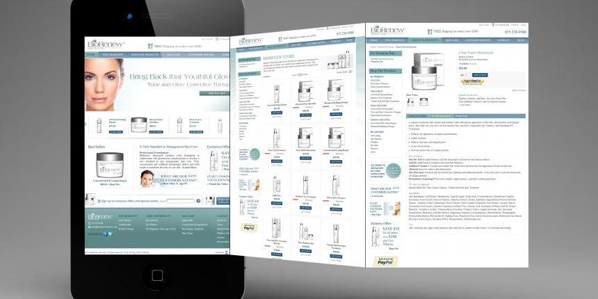
One of the most common issues heard in the beauty and skin care industry is about websites. Skin care websites often do not properly perform and therefore there is a lack of results. Lack of customers, sales, and profits can be devastating to a brand that relies on online sales and customer acquisition. So what does it take to have a skin care website design that delivers results?
The answer is a comprehensive answer. There are multiple factors that contribute to the success of a skin care website, design, and architecture. The website must be specifically tailored to the beauty and skin care industry. The home page has to be properly structured, and store pages have to convert.
Here are the most common elements that a successful skin care website design that delivers results has. To get hands-on assistance, brands can always work with professionals, when it comes to skin care website design. Consulting services are available for assistance as well as website design services. A professional and properly developed skin care website is a valuable investment for any size brand and startup venture.
Skin Care Website Design
Design Style
First, all skin care websites must be responsive design. A brand can in addition have a mobile only site, but the main website should be responsive. Responsive design means, it properly displays on all major devices such as smart phones, tablets, and computers. The colors should be complimentary or match the logo and branding of the skin care company, with preferably a white background. This is especially important on the shopping pages. All features and functions should be easily available and always in the same place, for customer convenience.
Home Page
The home page of a skin care website is the main landing page. It must therefore enable the customer to do what they wish such as pick products, shop, read, and quickly access what is mostly looked for on the website. Home pages of beauty sites are a critical part of the overall success of the website. They must be carefully structured to perform and deliver results. All incentives, call to actions, key products, and SEO elements should be visually well displayed on the home page.
Store Pages
The store pages tend to be the last page that a customer or site visitor end-up at before they add products to the cart and proceed through the checkout process. The store pages should enable the visitor and customer to quickly pick their products, read reviews, see prices, and deals. These pages should also display clearly all the trust icons such as secure e-commerce, BBB, 100% Money Back, and so on. The store pages should further have cross-selling and up-selling features and functions.
Landing Pages
Skin care companies and brands often overlook landing pages, but this is a mistake. Landing pages have much higher conversion rates for online sales and should be frequently used. They enable a brand to share much more niche information and focus on a specific product, treatment, or application as an example. Landing pages tend to be keyword oriented and specifically designed to rank higher in search engines. They are also structured to yield a much higher return on investment.
Checkout Process
The checkout process should be as short as possible, simple, and without any distractions. Brands must never force visitors and shoppers to register to shop. The checkout functions should be well visible and clear to the shopper. There is a high shopping cart abandonment rate (50%-65%). Short and simple checkout structures do much better, but shopping cart abandonment should be actively addressed to reduce.
Incentives
Online shoppers want incentives. Simply put, people go online to get better deals. Skin care brands that do not offer compelling incentives tend to experience lower conversion rates and sales. Incentives vary, but often include bundled packaged products and deals, discounts, specials, seasonal offers, coupons, loyalty programs and more.


