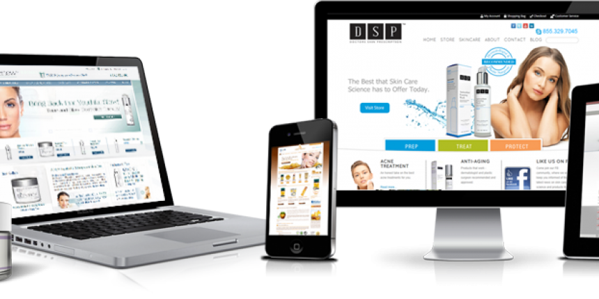
The beauty industry can be a very lucrative market, but also very competitive. Brands and entrepreneurs look how to gain market share and sales with niche cutting edge skin care technologies, ingredients, and applications. Websites are a critical component of the success of beauty brands these days. To help out, here are skin care website design tips and mistakes to avoid.
Regardless of size of company and brand, websites are a foundation for all online activity. They represent the brand 24 hours a day, 365 days a year, and worldwide. With e-commerce website design brands now sell worldwide, 24 hours a day, and every day of the year. Websites are the focal point of most skin care consumers and brands know this, which is why successful skin care companies have invested greatly into having a strong online presence and customer friendly website.
For skin care companies that want to improve their results such as website traffic, online sales, and customer retention here are skin care website design tips and mistakes to avoid with website design and development. This includes shopping carts and shopping pages, which must be properly created for best results.
Tip: Skin care home page design is critical to conversion.
When designing the home page of skin care websites, much thought has to go into the architecture of it. The home page is critical to many marketing efforts and online sales conversion. It has to be properly created with quality design and all the conversion tools and call to actions to provide customer service and drive sales. Experienced skin care website design agencies know what work and what does not, brands can get expert help for better results.
To Avoid: Home pages that lack functions, features, and content on the home page such as incentives, text for search engines, shopping cart functionality should be avoided by skin care brands.
Tip: Only use quality product photographs and multiple photos per product.
For improved sales, brands must realize that selling online is a different game as retailing skin care products. The consumer looses the ability to touch and feel the product and to try it out, so photographs or videos are the only method to help the consumer connect with the product. Skin care brands should use only high quality photographs professionally taken for their website. Each product sold online should have multiple photos of each product.
To Avoid: Brands and entrepreneurs should never use stock photography for products (from manufacturers) or poorly taken photos for websites. E-commerce websites do not convert well with poor product photos. Brands should avoid using only one photo per product as well.
Tip: Offer incentives to motivate site visitors to shop.
Online shoppers, especially skin care consumers shop online for deals. The consumer demands and expects a certain type of treatment online these days and this includes specials, discounts, seasonal deals, free shipping, giveaways, and other incentives. Brands must first of all offer certain incentives and then properly advertise them throughout their website, on their blog, and on other channels such as social media.
To Avoid: Skin care companies should avoid becoming stale with what they offer their customers or potential customer online when it comes to incentives. The same offer will become less desirable to consumers.
For best results, professionals can review a skin care websites and through the services of Conversion Optimization improve an existing website. Outdated websites that are not Responsive Design (mobile-friendly) should be upgraded (new website) to stay current and competitive in the online beauty market.


