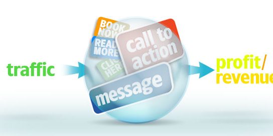
The home page of any type of website is the most critical page of the website. Most of the traffic lands on the home page and it tends to be the most visited page of a website. Keeping this in mind, it is no surprise that the home page is critical to the success of a website and business.
A common problem though is that companies tend to contract website design and development out to a firm that may or may not have enough business experience, particularly for that specific industry. Often the lack of experience of the firm causes a home page design to be ineffective. Sometimes, it is the preferences of the client (company) that make a home page ineffective.
While it might seem great to create a home page a certain way, aesthetically speaking, it may be disastrous for the business goals. Aesthetics and functions are not the same with website design.
Although usability and aesthetic look form the basis of good website design, a company and website design firm should think beyond these basics. For best results, the focus must include converting visitors to customers and the elements that make that happen. Here are 5 home page design tips to boost conversion rates of websites.
5 Home Page Design Tips To Boost Conversion Rates Of Websites
1. Use Contrasting Colors for Call to Action designs.
This can’t be stressed enough. Contrasting colors with the call to action (CTA) elements of a home page must be properly designed. For best results, a company should conduct A/B testing to improve conversion rates. See the Infographic below for more information on colors and CTA color choices. This is a very critical aspect of results oriented website design for home pages.
2. Utilize Whitespace on the home page.
Great home page designs include the use of whitespace to make things stand out such as the CTAs of a home page. Visitors do not like searching for the action buttons on a home page. Whitespace is a great way to make things pop on a home page such as the form mailer; buy button, or sign-up link. Whitespace also helps to keep things cleaner and less cluttered.
3. Place Visual Cues to point to the Call to Action areas.
To make call to action areas of a home page easily found, the use of visual cues should be used. Visual cues can be directional such as the graphical use of arrows to point to the form mailer, sign-up area, or purchase buttons. Sometimes the visual cues are not graphical arrows but words such as “Start Here” for example. Placing visual cues on the home page increases conversion rates of a website.
4. Color frame the Call to Action (CTA) areas.
The CTA of the home page is the most important area. This is the reason why the CTA should be color framed to stand out the most on a home page. Regardless of the type of CTA (join, sign-up, buy, lead gen, etc.) – a color that will make it stand out should graphically frame the area for best results.
5. Use the proper incentives to increase conversion.
People love deals and this is especially true online. Service companies tend to offer a free consultation, while retailers of products offer free shipping. Either way, an incentive is used to get the website visitor into action to execute the Call to Action. For best results, companies should use the right incentives on the home page.


