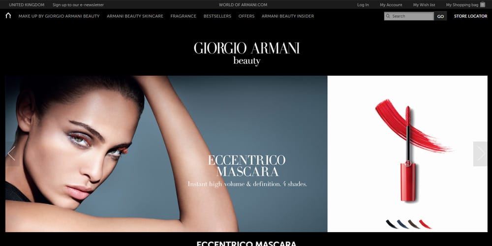
Beauty website designs that produce results must be properly created. The beauty industry is not the same as other online commerce markets. The beauty consumers are highly educated. The beauty consumer has gotten accustomed to a certain level of quality in website design. Results driven beauty website designs include specific elements, which are discussed here.
The skin care and cosmetic consumer has many choices these days. There is no shortage of brands already within this sector or entering it. It is a highly fragmented market. It is very lucrative as well as competitive. It takes a budget and time to succeed in the beauty market. The website is foundational and critical to the success of a beauty brand.
All e-commerce websites are more complex, but for the beauty industry they tend to be much more detailed oriented. Beauty websites usually incorporate much more information. Offer more frequent incentives and display aesthetically a more beautiful design. Afterall, it is the beauty industry. Consumers judge the brand by how it looks online. Yes, we do judge the book by its cover.
There are key elements of a beauty website. These stand out and results driven beauty brands incorporate them effectively. Below are the most popular elements of beauty website designs.
Elements of Beauty Website Designs
Customer Service Features
Even though it is online commerce, consumers want to be able to reach someone. This means, beauty retailers have to incorporate customer service features. An email or an online form is not sufficient enough. The right elements would be to leave space in the page headers for a toll-free number for customer service. This way, it is visible on every page always on top. Especially, on the shopping pages. This adds credibility and trust to the brand. Chat features are also a great way to provide enhanced customer service features.
Display Payment and Service Icons
Incorporating small images as icons is the best way to display payment, service, shipping, and security details. Consumers want to trust an online retailer, but it is the brands job to display credibility and options consumers have. Icons are a great way to get this accomplished. Displaying that the site is secure, what payments are accepted, how products will be shipped, and so on is critical in beauty website designs.
Videos to Introduce and Explain
There are vast amounts of beauty products. Consumers are much more likely to buy a beauty product after watching a video. Especially, if this video introduces products, application, benefits and explains it in more detail. Videos are a great sales tool. Video marketing is becoming the fastest growing marketing method. Pages with videos incorporated are more likely to rank higher in search results.
Clearly Designed Areas for Incentives
Often missed in retail websites are clearly designed areas for incentives. Incentives are critical it is the reason just about every consumer buy or not. Incentives can be many things. Most important, it is how they are displayed, where, and how often on a retail website for the beauty industry. Also, incentives are lots of things such as discounts, specials, deals, contests, time sensitive promotions, seasonal promos, freebies and giveaways. All of them should clearly stand out and changed out frequently for best results.
Retail beauty companies that wish to improve online sales and their website can work with experts to get this accomplished. There are professionals that specialize in the beauty industry as well as retail, such as Illumination Consulting. Experienced beauty industry staff can create results driven beauty website designs. Contact us today for a consultation. We look forward to hearing from you. Friendly staff is ready to discuss your project with you.


