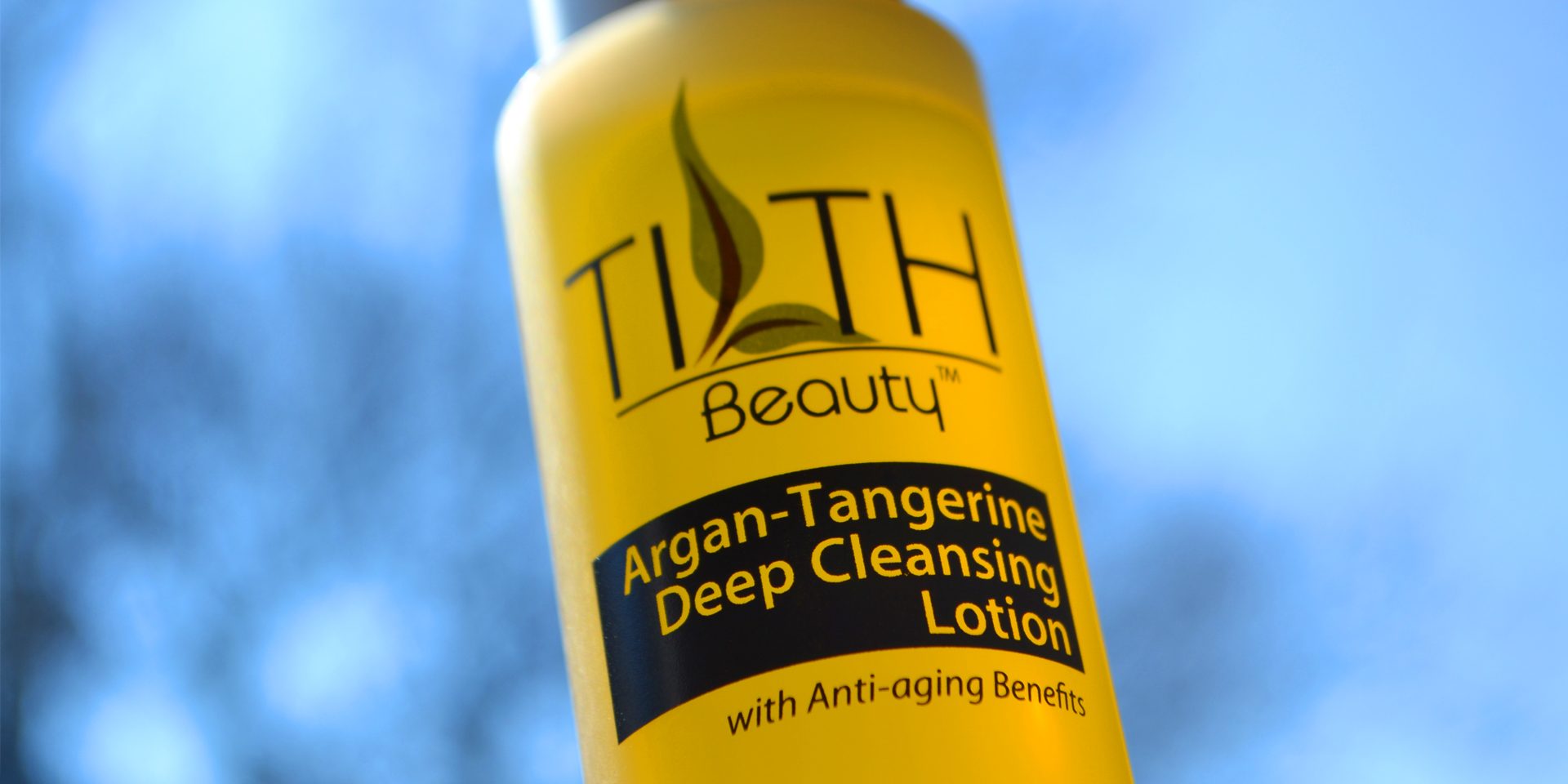
When customers walk down an aisle in a store, skin care brands have only a couple seconds to catch their attention. Brands compete with all other brands within the aisle and around them. So, how does a skin care packaging design standout and get the attention of a potential customer?
Packaging designs for beauty products and skin care have to be attractive, standout, and convey a specific message. There are several things to consider when creating packaging designs. Here are the most important elements to take into consideration, when creating packaging designs.
ABCs of Skin Care Packaging Design
First Impressions Count Make it Attractive
Skin care consumers when looking at beauty products will within a couple seconds either be attracted to them or not. Brands have a lot of work to just get their products on the shelf or drive visitors to online stores, once a consumer is viewing the skin care products, brands have but a couple seconds to either catch their attention or loose the potential sale. The design of the packaging has to be eye catching and attractive to the desired target market.
Be Different and Unique with the Design
Brands must standout from their competition and attract the attention of potential buyers and customers. Be unique and somehow different in designing the packaging to be most effective. There are several elements that can be alliterated with packaging design to be more unique. From color, to shape, to style and so on. Brands should research their direct competitors and create a different look to be more unique.
Choose a Unique Brand Name
There are a multitude of names in use for the beauty industry and many are similar. For a beauty brand to stand out, companies have to choose a more unique name that will be remembered by potential customers. When companies have memorable product names with attractive packaging designs, they have better chances to succeed.
Colors are a Critical Element of Design
By now, most people know that colors evoke emotions and certain responses. We use colors in logos and other areas of our lives to convey certain message and trigger emotional responses. With packaging design, it is not any different. The power of color should not be underestimated. Brands must use colors to stand out with skin care packaging. Again, researching competition to see what colors are being used and creating something different that will standout is critical to success.
Typography is very Important
The typography gives emotions to what is being said. Skin care brands should give careful consideration to what type of typography is being used on the packaging. Shapes, colors, and different fonts eke different moods and responses by people and potential customers.
What is being Said
The copy of the packaging has to express everything that the colors, typography and type of packaging do not. Words chosen should be carefully reviewed and all necessary and required information included on the packaging. What is being said is important within the beauty industry. Brands have to create packaging with all the appropriate content, but still keep the design attractive and not cluttered looking.
In general, skin care packaging designs must have a comprehensive approach to the look & feel of the beauty products. Everything should go together well and be in sync with each other from colors, to packaging material, and the content.
Brands that want to ensure to get quality packaging design can always work with firms that have plenty of experience working within the beauty industry. Industry knowledge and sufficient competitive research can drastically help to create successful packaging designs. Graphic design has to be attractive and meet the expectations of customers, distributors, and retailers.


